Morrow Index — Primary Signature
A launch-ready identity for a material-intelligence studio, combining an editorial wordmark, a proprietary folio emblem, and a restrained dawn-toned material atmosphere.
brandbrand logo horizontalEditorialElegant

Explore logo and brand directions from a short description of your product, audience, and personality. Start free and shape a visual identity you can keep developing.
Start free · Your format is already selected
A launch-ready identity for a material-intelligence studio, combining an editorial wordmark, a proprietary folio emblem, and a restrained dawn-toned material atmosphere.
A launch-ready identity specimen for Tallyform, a B2B platform that helps architects specify and compare modular interior components.
A monochrome identity specimen for Turn Index, an archive and publishing studio that helps cultural organizations digitize collections and turn research into editions.
A spare identity specimen for Nodemap, a systems strategy studio that helps organizations understand relationships, sequence decisions, and move complex work forward.
A dense monochrome master identity for Nodal, a systems strategy studio, uniting an engineered N mark with the promise “Make Complexity Cohere.”
A primary identity for Morrowline, a strategic foresight consultancy, built around a proprietary wordmark and a concise promise about durable decisions.
A precise square identity for Tracefold, a data-integrity platform that turns lineage into auditable evidence through a distinctive folded-route monogram.
A dense organic-modular identity tile for Trellis Works, pairing a woven TW emblem with the launch statement “Make progress take root.”
A stark, expressive identity for FORM/INDEX, an independent digital catalogue of collectible furniture, lighting, and limited editions.
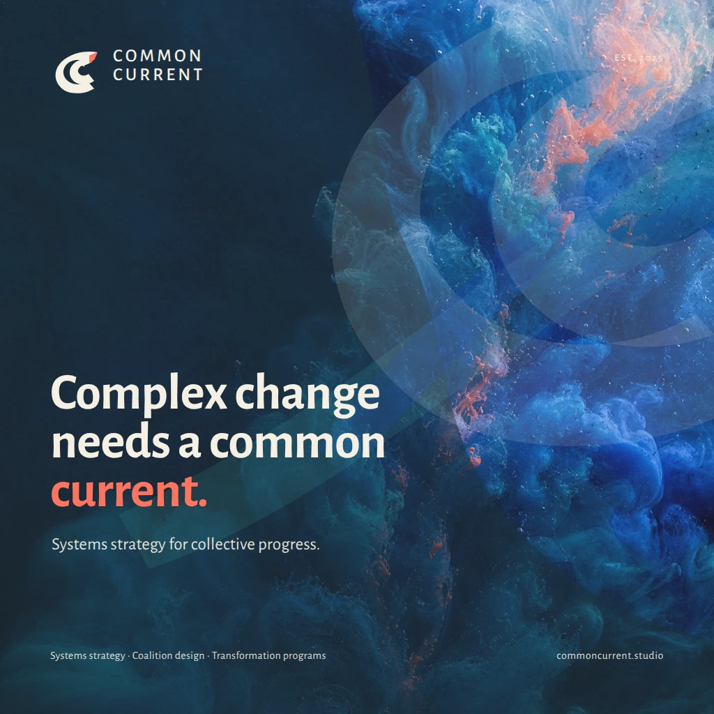
A launch identity for Common Current, a systems strategy studio helping climate, civic, and social-impact teams move complex change together.
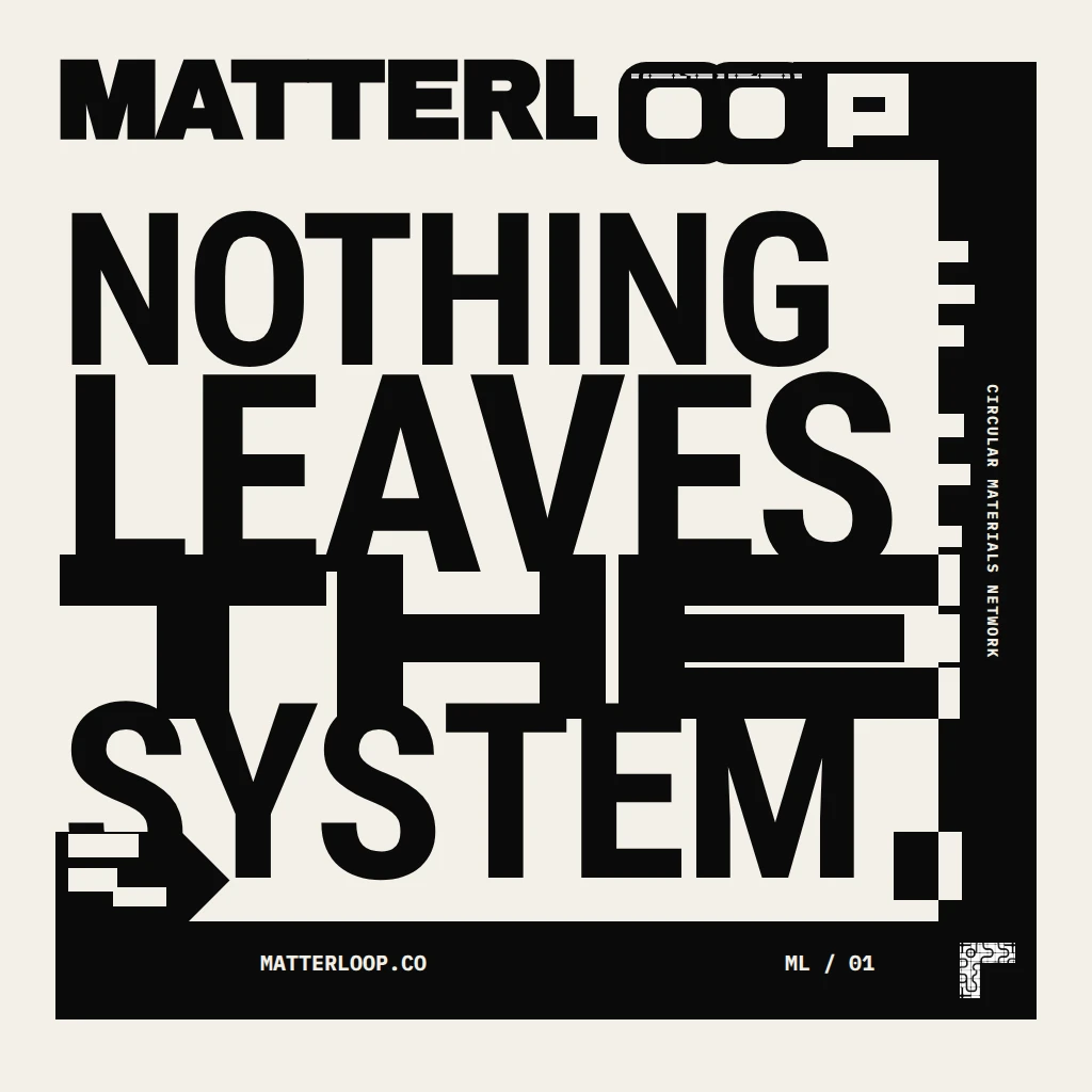
A compact campaign identity for Matterloop, a circular-materials network, turning Nothing Leaves the System into a dense typographic loop with a reusable modular flow pattern.
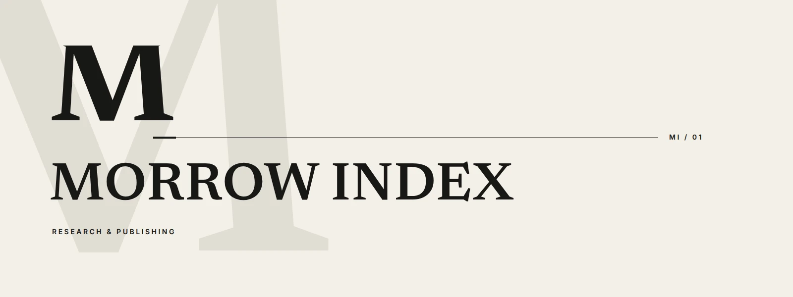
A horizontal identity for Morrow Index, an independent research and publishing studio, combining an editorial wordmark, ownable monogram, and catalog-like notation.
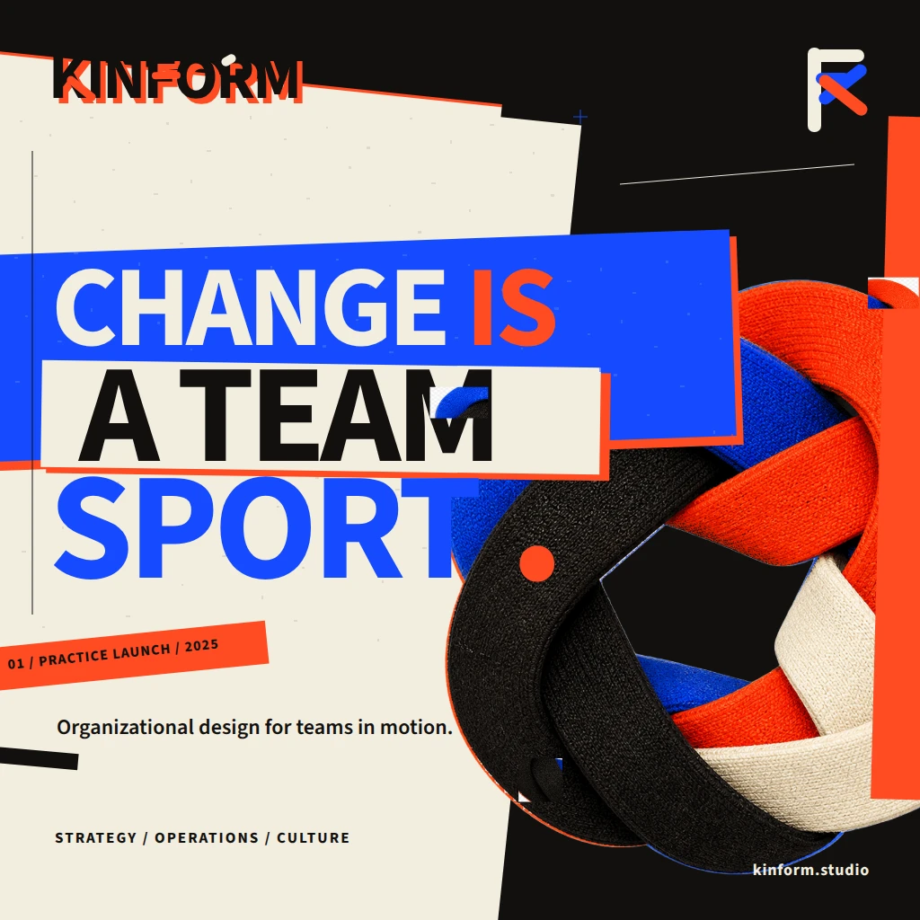
A high-impact brand launch artifact for KINFORM, an organizational design studio that helps teams align strategy, operations, and culture.
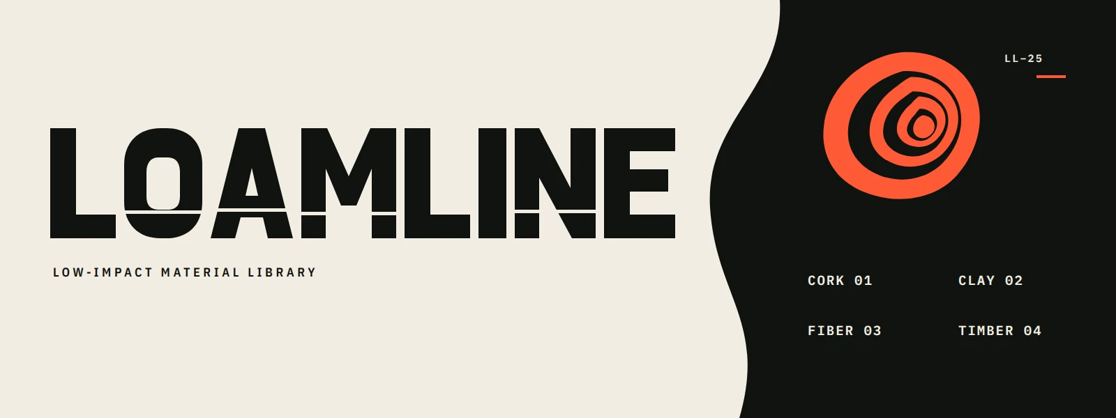
A high-contrast horizontal identity for Loamline, a specification-ready catalog of low-impact cork, clay, fiber, and timber finishes.
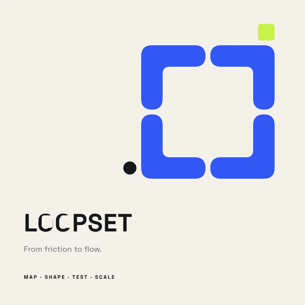
A square identity specimen for Loopset, an operations design studio whose four-stage method is encoded in a distinctive open-loop process mark.
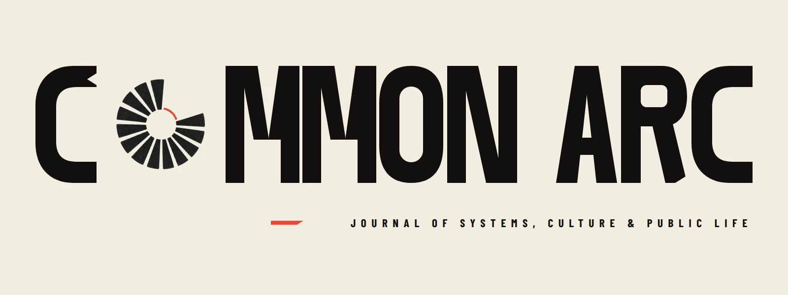
A high-contrast editorial identity for Common Arc, an independent journal connecting systems, culture, and public life through consequential reporting.
A primary identity concept for Veridex, translating multiple evidence streams into one defensible outcome through a bold geometric signal.
A modular identity for an operations-design consultancy, using an original relay symbol and concise method key to express continuous improvement.
A bold horizontal identity for Loamline, a B2B library that catalogs regenerative materials for architects, product designers, and sourcing teams.
A distinctive campaign identity for Northline Advisory’s 2025 Perspective Series, pairing “The Long View” with a clear promise of strategy beyond the quarter.
A monochrome campaign identity for Clear Signal, a workplace attention initiative that turns visual interference into a memorable call for calmer, more focused work.
A square identity showcase for Field Index, a research library that helps design and procurement teams evaluate plant-based and reclaimed materials.
A bold horizontal identity for Relayform, a workflow infrastructure company helping distributed teams design, automate, and operate connected systems.
A bold horizontal identity for Shift Local, a citywide campaign asking residents to move one weekly purchase to an independent business.
A primary identity for Foldline, an editorial strategy studio that turns complex research into publishable narratives, built around a source-derived folded-page emblem and bold wordmark.
A tactile, atmospheric primary identity for an environmental intelligence studio connecting coastal field knowledge with decision-grade data.
A launch-ready identity specimen for a circular materials exchange, combining a modular relay emblem, humanist wordmark, and tactile reclaimed-material swatch.
An expressive horizontal identity for Civic Current, a strategy and service-design consultancy helping institutions turn complex systems into humane public services.
A high-contrast identity for Tendril Index, a regenerative materials library, pairing an editorial wordmark with a cataloged botanical specimen emblem.
A horizontal master identity for Common Index, an independent research and editorial consultancy that turns complex evidence into clear decisions for institutions and leadership teams.
A primary horizontal identity lockup for Threadline, an organizational design consultancy, pairing a modular woven mark with the campaign promise “MAKE CHANGE HOLD.”
An assertive square identity for NEXT FORM, a circular-design campaign built around the rallying line “MATERIALS STAY IN PLAY.”
A square identity launch asset for Northline Assembly, pairing an original modular monogram with the defining statement “Make Complexity Useful.”
A high-contrast horizontal identity for Motive Loop, an operations-design consultancy whose Sense–Shape–Ship method turns uncertainty into workable change.
A horizontal identity for Civicway Mobility’s shared-streets initiative, using deliberate breathing room to make courtesy and coexistence memorable.
A premium identity concept for Canopy Ledger, an ecological intelligence consultancy that translates living-system data into trusted decisions.
A monochrome master identity specimen for Index Form, a material intelligence studio, combining a modular IF mark, catalog metadata, and a sculptural paper study.
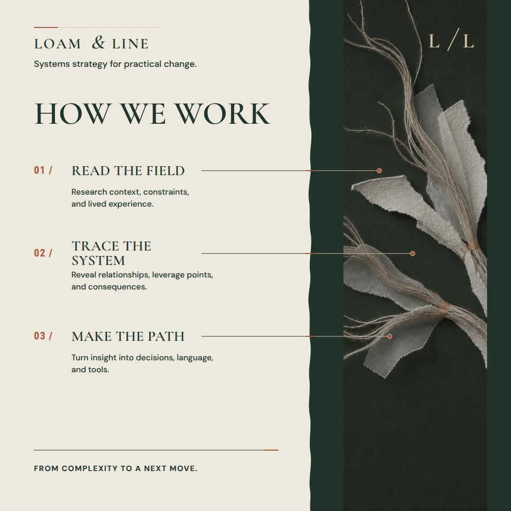
A square identity launch tile for Loam & Line, a systems strategy studio, distilling its field-to-action method into three concise stages and a tactile living-systems motif.
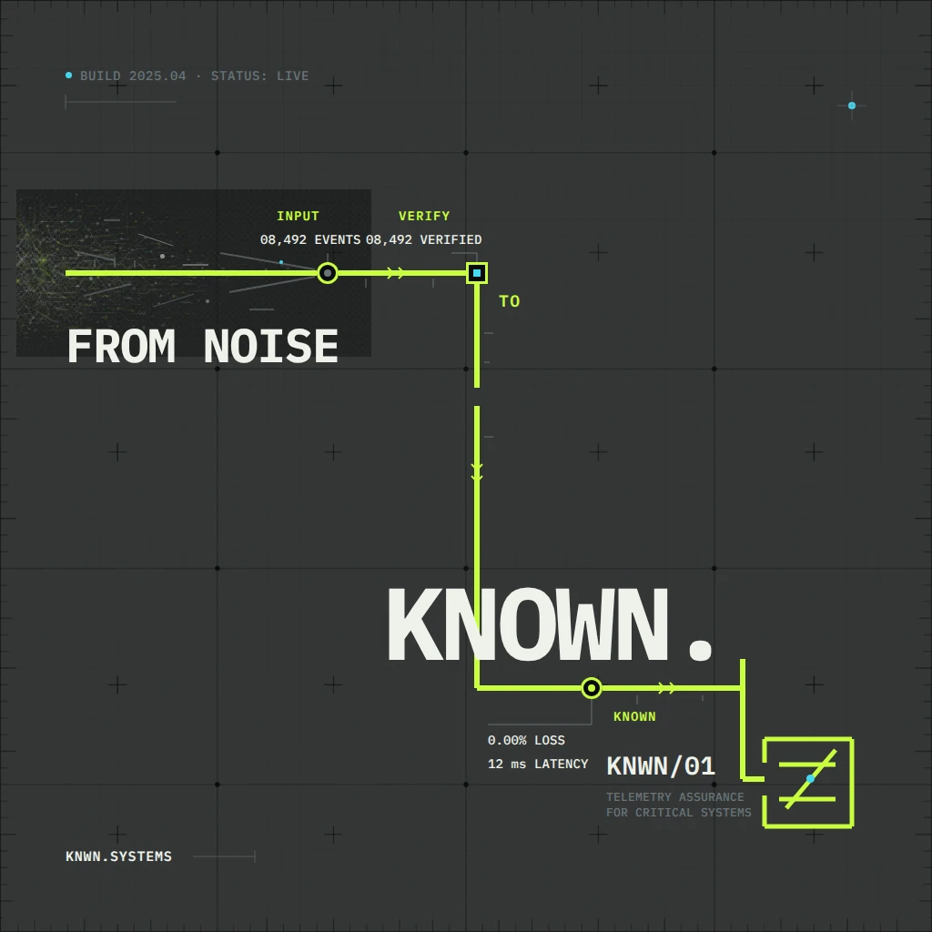
A launch identity graphic for KNWN/01, a fictional telemetry-assurance platform that turns noisy system signals into verified operational records.
A bold horizontal identity for an atmospheric intelligence platform, pairing a custom contour emblem with a precise technology wordmark.
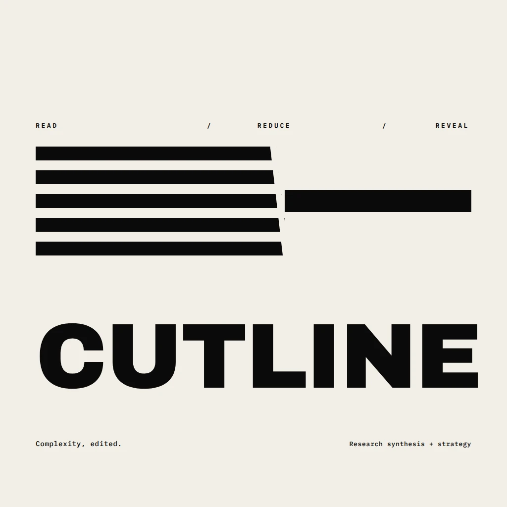
A monochrome identity for CUTLINE, a research-synthesis studio, using a sharply edited many-to-one emblem to turn its READ / REDUCE / REVEAL method into the logo itself.
A bold horizontal campaign identity for a community renewable-energy initiative, expressing collective momentum through an integrated radial current symbol.
A compact, human-centered identity for an organizational strategy consultancy, pairing a woven modular emblem with the promise “Make change workable.”
A high-contrast horizontal identity for Form/Index, a curated architectural material catalog, pairing an uncompromising wordmark with a proprietary folded-plane emblem.
A precise monochrome horizontal identity for Ordina, a digital specification catalog, built around a catalog-tab emblem that doubles as the initial O.
A bold modernist identity for Common Orbit, an independent journal connecting civic ideas, technology, culture, and public life.
Primary identity for Ledger & Signal, a premium evidence-intelligence consultancy, pairing an editorial wordmark with a geometric verification aperture.
A poised public-interest identity for an urban water resilience campaign, combining an editorial wordmark, expressive punctuation, and a storm-to-clear atmospheric transition.